Temeda’s Analytics Dashboard provides easy visualizations of all your data. Get a big-picture view of your organization with critical metrics, trends, and easy visibility for any improvements to operate more effectively and enhance your overall business performance.
Analytic Dashboards
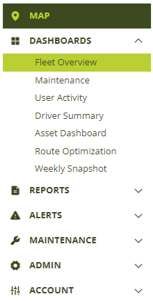
- Fleet Overview
- Maintenance
- User Activity
- Driver Summary
- Asset Dashboard
- Weekly Snapshot
Getting started
Dashboards can be found in the menu bar under Dashboards.
Dashboard Views
There are several tabs available in each dashboard, each with specialized graphs that provide maximum insight into your fleet. They are located at the top of the page.

- Summary – Key metrics from each of the main components below.
- Assets – A breakdown of your equipment, types, and age.
- Utilization – A breakdown of actual engine runtime vs. targeted runtime.
- Engine Hours – A breakdown for assets that capture engine runtime.
- Odometer – A breakdown for assets that capture driving distance.
- Alerts – A breakdown of all alert events triggered within your organization.
- Driver Safety – A breakdown of driver safety alerts and events.
Dashboard Filters
Use the Filter Pane to drill down, analyze, and explore your fleet data. Selections made on the filter pane will be reflected in each dashboard tab. Click the top right arrow to hide the filter pane for a full-screen view of your dashboards.
Cross-filtering
Clicking on a subset within a chart, such as an asset or group, will cross-filter the other charts to the same field. The same can be done by clicking on a date within a chart. To clear the cross-filters, click on the same date or subset that was initially selected.

Date Filter
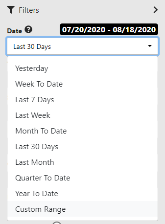
Choose from a variety of pre-defined date ranges or use the Custom Range option to define the date range.
Time Unit Filter
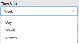
Choose how time units are grouped along the bottom of the charts.
Summary Level Filter
Choose what you want to compare using the Summary Level filter.
Note: Fields such as Make, Model, and Equipment Type must first be saved in the Asset Detail form.
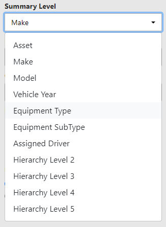
To further narrow what’s being compared in the views, select multiple fields from the Summary Level. This capability allows users to make side-by-side comparisons.
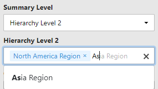
Use the Groups filter to compare one or more Groups.

Tool Tips
Every chart has an explanation that can be found by hovering your mouse over the question mark in the top right-hand corner.
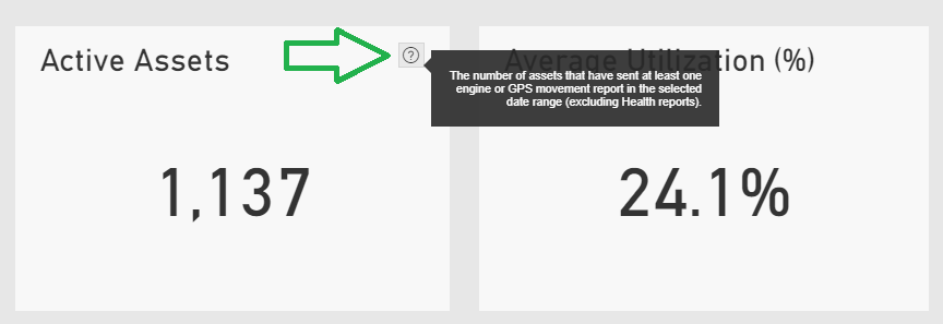
Viewing charts
How to maximize a chart
Maximize a chart by clicking the Focus Mode button located in the top right-hand corner of the chart.
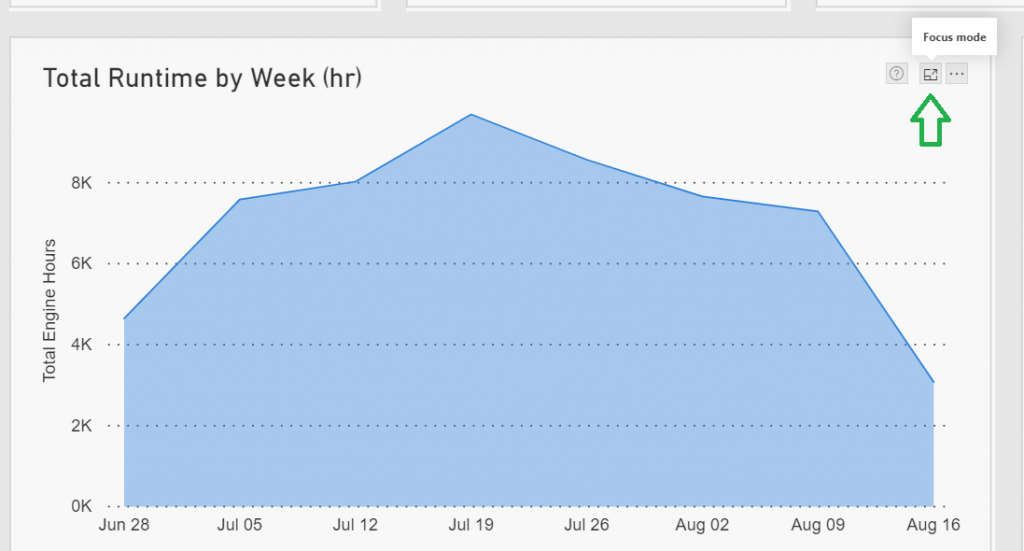
How to view charts as a table
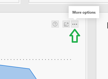
To show the chart data as a table, click the More Options button in the top right corner of the chart.
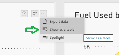
Next, click “Show as a table.”

How to spotlight a chart
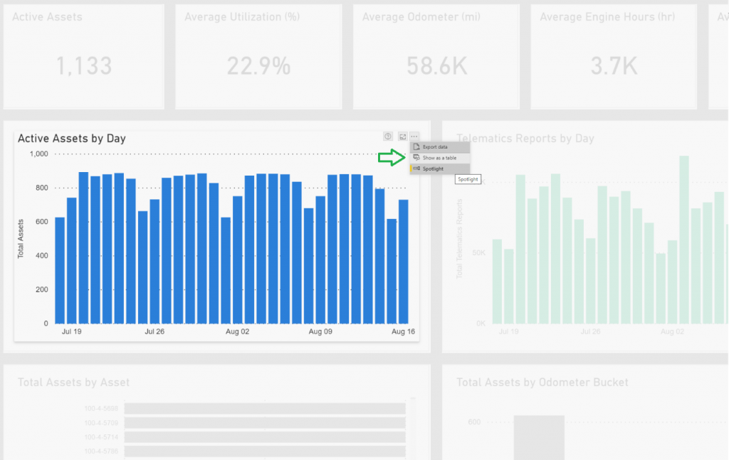
Spotlighting a chart will shade out all other charts in the view. To spotlight a chart, click the More Options button in the top right corner of the chart.

Next, click “Spotlight.”
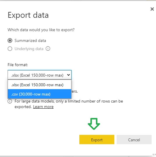
How to export data
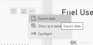
- Click the More Options button in the top right corner of the chart.
2. Click “Export Data”.
3. Select the file format and click “Export.”
How to print
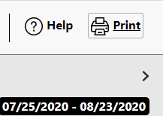
Print any view by clicking the “Print” button in the top right corner.
